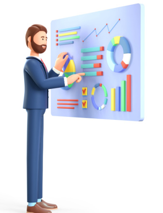
We know that presenting data in meaningful ways is essential for you in making timely, critical business decisions. Instead of throwing complex deliverables or dense unrefined information at our clients, we’re oriented towards usefulness and simplicity. Tabulation, charting, and reporting are essential components of data analysis and presentation. These processes help transform raw data into visually appealing and understandable formats, making it easier to communicate findings and insights to clients.
Our advanced research tools allow us to provide key insights in a highly visual and easy to understand format. Our highly trained, experienced and flexible team generates tables that turn your data into actionable insights. Our interactive reports on survey data will help your team grasp the significance of your findings.
Our Trained, experienced team summarized and organise data into tables which provide a structured way to present data, making it easier to compare values and identify patterns. We create visual representations of data to aid in understanding and interpretation. Charts and graphs are effective tools for conveying information, trends, and patterns. We generate reports based on the survey that present the results of data analysis and interpretation. NSMX provide a structured format for communicating findings, insights, and recommendations to clients.